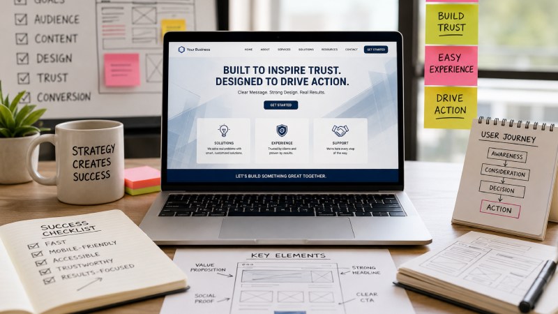
An effective company website accomplishes much more than just looking good. It gives users an understanding of what your company is all about, why your services are significant, and how they can act on your proposals after visiting your site. The most efficient websites give the user clear answers to these questions, regardless of whether they’ve arrived from a search result, a referral, or a sales email.
Using business goals and actual expectations of visitors before the deployment of visual elements helps generate clarity.
Start with one clear goal for a website
The websites must carry out their main task which might include creating interest in the specific product or service, explaining a challenging service, finding the people who meet the criteria for a position, selling the products, and providing services to the existing clients. Even though any website may achieve various results, there should always be the main one that impacts the website navigation and content.
Find out what the primary action is, what the main conversion route is, and name some of the preset metrics to track such as announcements, consultation requests, and purchases, like ‘book a consultation’ for a consultancy agency.
Focus on the questions the visitors have
Visitors do not intend to understand marketing jargon. They are seeking specifics: what this institution does, what it provides, what problems it solves and what are the grounds for trusting it. What will happen if I ask a question about the company? This must be answered in a logical order.
The information that is collected from calling customers, talking to clients, analyzing support tickets and queries, and checking data analytics should indicate the real language of consumers.
Create a simple structure for your website
For small businesses, a limited number of pages may be sufficient, while large companies may require pages with detailed parts and sections according to the field of business and product. Generally, companies should have a homepage, about us page, subpages for services, product pages, case studies, resources, and contact pages.
- Carefully list all the pages that are required for your business.
- Group information which is the same in every way.
- Delete pages that are similar or not useful.
- Organize pages according to visitor needs rather than company departments.
- Make sure all the important pages are in easy reach and follow few clicks away.
Plan a homepage that explains the business in no time
The homepage informs users about the business offerings, its benefits, and the reasons for its attractiveness to the customers. A short summary of the offer and a call to action should also be placed on the homepage. Moreover, the visitors should be indicated other options, such as checking the services or reading the case reviews.
Give proof but without making the page crowded
Trust increases when statements are backed up with facts. Broad terms such as “best in industry” should be substituted for specific achievements of customers and anecdotes, certificates, credentials, and other specifics of the process, as well as samples of work. If solid figures are presented, it is important to explain what outcomes improved and according to what indicators.
Proof should appear next to the statement it is supporting. A quote about swift implementation should come next to the delivery process. Logos and awards can be highly effective, though they shouldn’t be a distraction.
Use graphical design to attract attention
Visual hierarchy indicates to the users which aspects of the website to observe first. Each segment of information should have a principal idea of attraction, clear headings, appropriate spacing of the text; moreover, important action buttons should be different from links of less importance.
Be careful with very big videos, automatic movements of objects, and unnecessary decorations. These things might take attention away from the message, slow down downloads, and confuse a visitor on the site. The design should help in understanding the content, rather than competing for the viewers’ attention.
Include accessibility in the plan
Accessibility is at the baseline quality level. Use proper heading levels, good contrasts, well-labeled forms, navigable keyboard inputs, good text descriptions for images, etc. The Web Accessibility Initiative of the World Wide Web Consortium (W3C) advises how to write, design, code, and test websites properly.
To improve accessibility, we have to start by ensuring that everyone’s experience is improved, such as mobile users, caption users, voice control users, slow connection users, and users recovering from injuries, among others. Always incorporate accessibility at the beginning of the site design.
Focus on speed and usability of the mobile website
A beautiful website can start losing its value if it is slow or complicated to navigate on mobile gadgets. Make sure to optimize images, get rid of unnecessary scripts and third-party applications; use responsive design and install buttons that are easy to tap so that the most important information is available on gadgets with small screens.
You must do some testing across all sorts of gadgets with different speeds. Performance testing is good but remember that your visitors may be using old phones, looking for information over congested networks and having limited access to the Internet.
Create content to assist people in making the decision
Content that serves a practical purpose is critical during all steps of decision making. Visitors require pages that yield information, pages that allow comparison of various options and compromises, proof pages that show authority, and action pages that enable easy inquiries. Making use of pages displaying worthless content, which serves as an attraction for users to your page, should be avoided.
Make sure to evaluate your pages based on Google’s content guidelines. Here is a simple test: Would the visitors still find your material useful even if search engines were non-existent?
Test, launch and improve the website
The cycle for endless improvement kicks off on launch day. Prior to going live, pay attention to forms, links, titles, mobile design, loading speed, button labels, image captions, and placeholder text. Configure analytics and tracking for conversions in order to analyze visitors’ behavior after they arrive on your site.
The site should be reviewed quarterly to identify information that is outdated, pages that boost exit rate, forms not filled out properly, low engagement levels, and paths that are unclear. Upgrading can be more effective if it takes place gradually rather than waiting for a complete redesign.
Common Questions About Company Websites
How many pages should a company website have?
The ideal number of pages differs from one entity to another. While some organizations may only need a few pages of content to pass their message, others may have to invest thousands of pages in describing the services provided, the audience targeted, as well as the locations of service provision. That is why it may be more beneficial to concentrate not about the ideal page number of a company’s web site but on making the website more user-friendly and understandable for its target audience.
What should appear above the fold?
You have to include a customer value proposition, a brief context and one clear action visitors need to do. The aim of the first screen is to help visitors get the idea instead of delivering all the information.
Should a company website use video or animation?
Use animation to show products, processes or feature useful information to your audience. Avoid using video for making visitors wait or missing the main action.
How often should website content be updated?
Check the main pages of the website every few months and update the information that has changed: services, pricing, team, numbers, policies etc.
Conclusion
An efficient corporate website does not start with beautiful design and colorful pictures, but rather with openness. When the clients’ queries are answered, necessary information provided, good evidence given and the website is simple to use, it becomes an effective platform.